Overview
Trained as an architect. I still think about design the same way—building systems that are structurally sound, scalable, and beautiful. This is my proof of that.
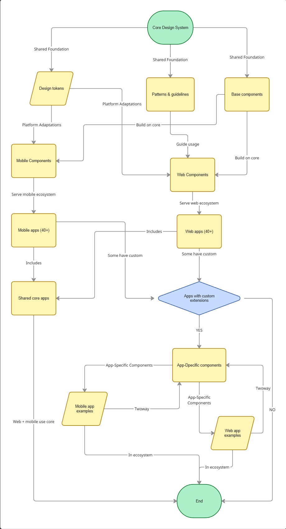
Infinity Design System (NDA name) utilizes the most up-to-date MCP Server and AI models in VS Code to increase adoption and ease of use for all stakeholders from designers, developers, product manager, and marketing. This allows the closest we have from design in figma to production ready code use micro-frontend framework. I am responsible in setting up responsive components, variables, and code connect in Figma, ensuring that all naming structure and code syntax is scalable to development using MCP Server. The dream is to lead the rest of product by design through this design system. This live demo Storybook is a demo of an NDA design system that I built for an Enterprise company with 40+ applications, 100+ engineers, and 50+ enterprise clients in one giant ecosystem.
My role
Lead Product Designer
- 💠 Components
- 🔒 Variables & Tokens
- 💾 Figma and Storybook MCP
- 🤖 AI Prompt Standardization
- 📄 Documentation
Tech Stack
- Frontend: Storybook, MUI, React Native Paper
- Single Source of Truth: Figma
- Documentation: Docusaurus
Scalable System
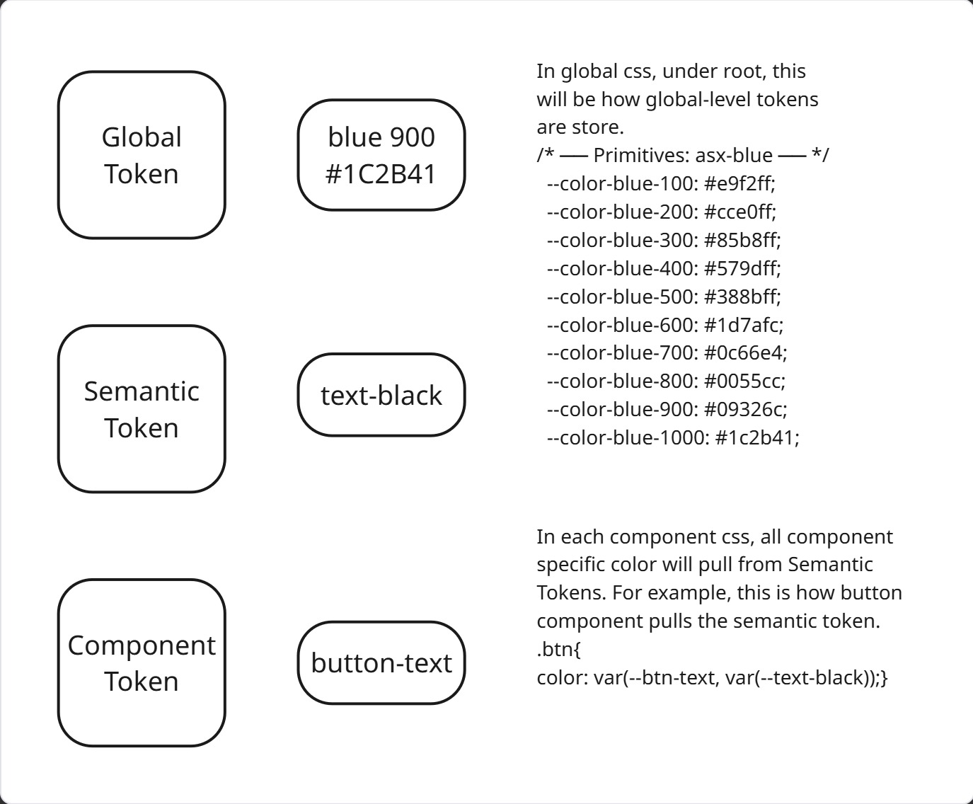
I ensure that the naming structure of all components and variables are scalable, so even developers are using the same name in their CSS style tokens. We use atomic names and split the naming levels into three(3): Global, Semantic, Component. Global is for all Foundation level tokens such as color and typography. Semantic is for things shared by more than one component, such as background-color. Component is for tokens that are unique and specific to one component and they are not repeatable.
AI-assisted Workflow
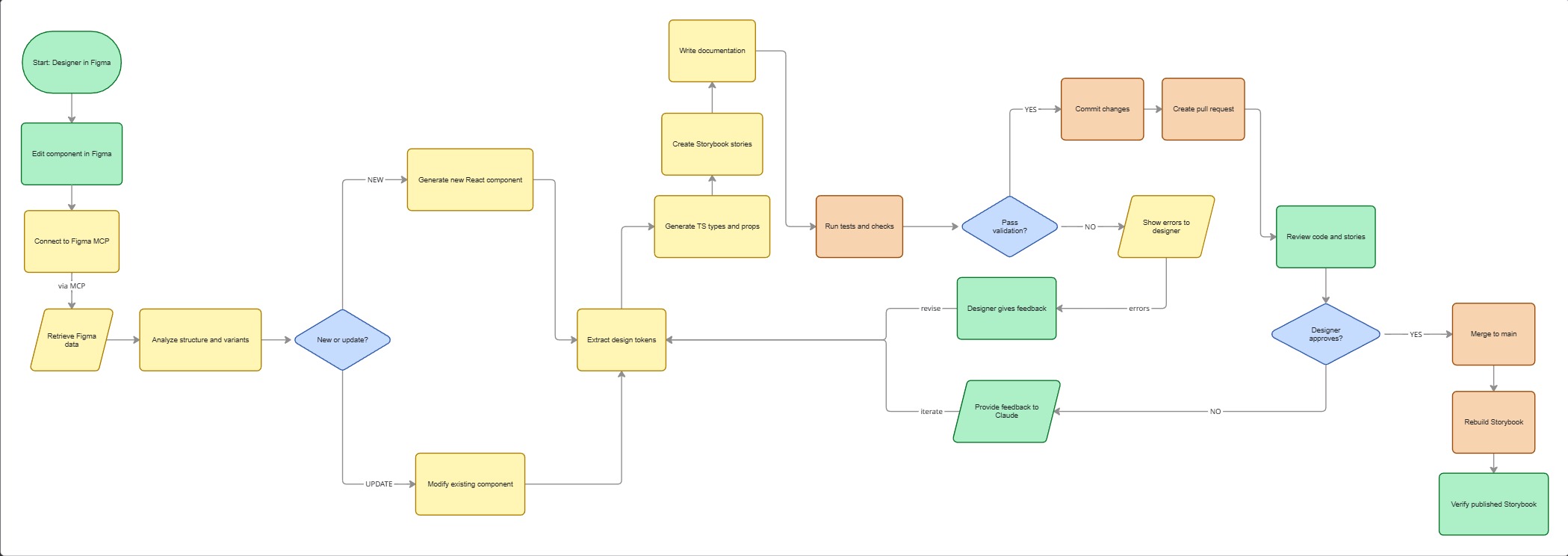
To allow further 1:1 design-code parity between components in figma for designers and storybook for developers, we started by mapping out what a Figma-Storybook workflow should be. We created simple script to do this.
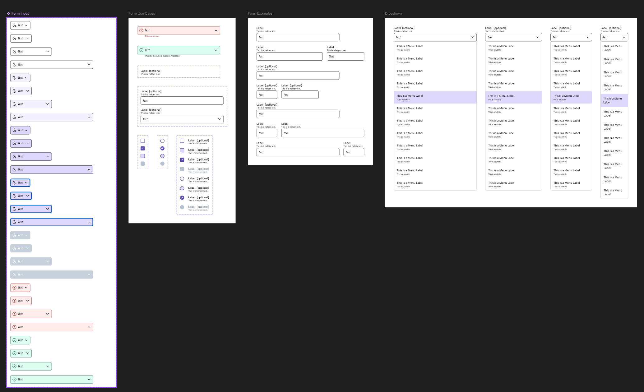
Responsive Component
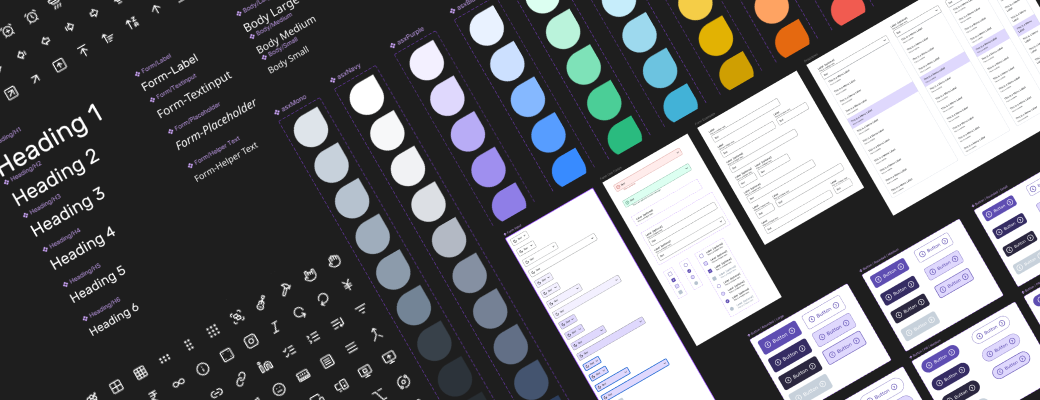
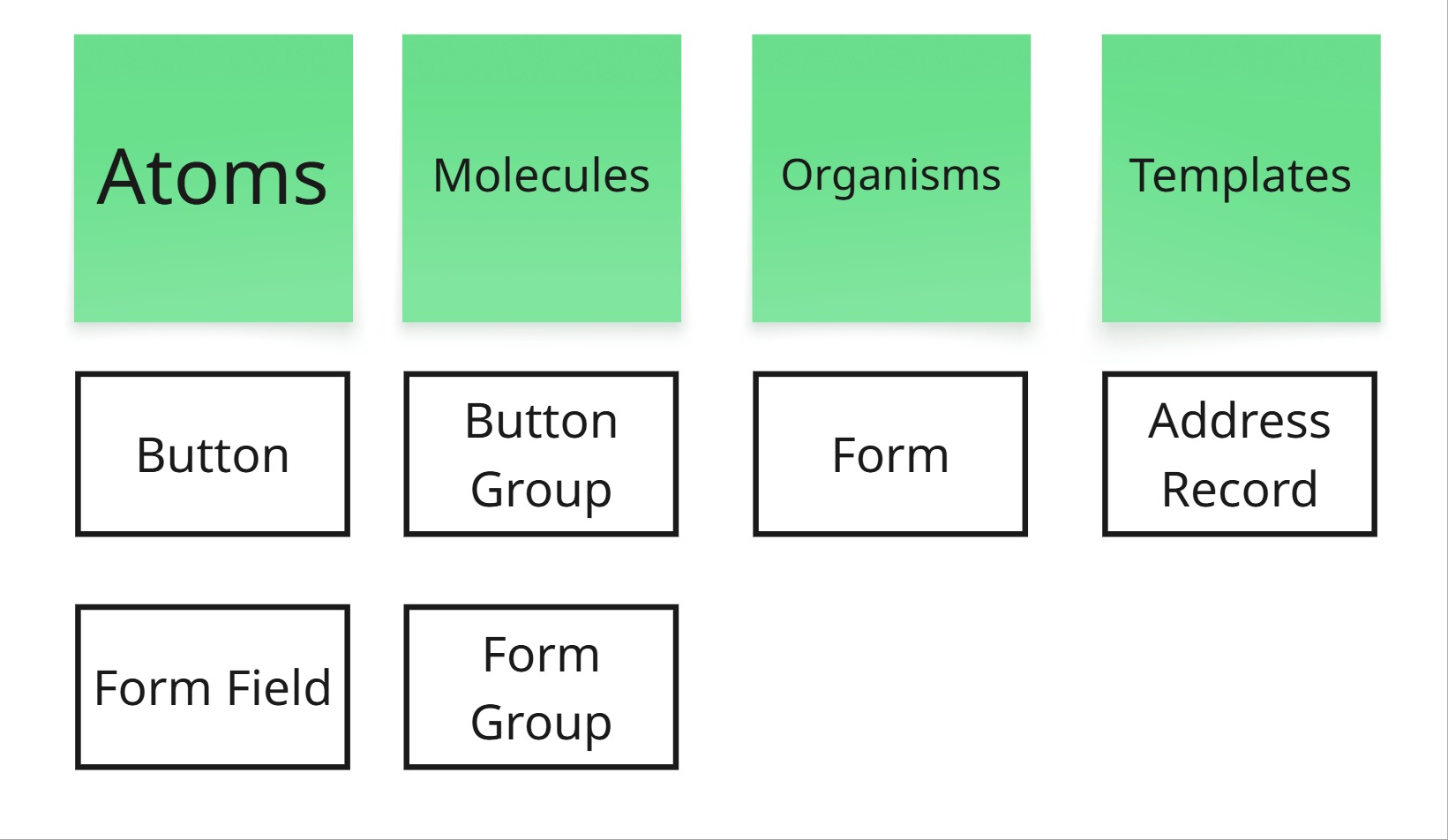
All component is responsive that allow designer to quickly make prototype to show clients to validate the design and allow hand-off as reusable component via Github Copilot in VS Code. As we are using MCP Server and utilizing LLMs through Github Copilot in VS Code, we ensured that all text-based UI element has a name that will make the LLMs understand better, such as ensuring that each Figma layers are properly named and has Dev Mode annotation separated by their types such as for interactions and accessibility. We found that LLM-based model understand text-based input better. We use Atomic Design framework to structure our components in Figma.
Consistency
To ensure consistent quality, we utilize the text-based prompt of LLMs. For example, we have standard text-based prompt to create the react prototype for non-developers to create a prototype using the least possible prompts through MCP that ensures WCAG compliant and that it is creating reusable components that we can ship to developers that allow them to turn it into production ready code.
Challenges
The hardest part wasn’t the technology—it was the unknown. We didn’t know if MCP would work. We didn’t know if stakeholders would adopt it. We spent 3 sprints experimenting, failing fast, and learning what worked. The breakthrough came when we realized LLMs perform best when component layers are named with intent—not generic labels.
We built the token structure too rigidly at first. It took two sprints to realize we needed more flexibility for mobile vs. web. That taught us to build for the edges, not just the center.
Outcomes
-
Adoption: The system is now used by the whole company for the whole ecosystem with multiple products within it.
-
Design Velocity : Component creation time dropped from ~4 hours to ~45 minutes using the MCP-powered AI generation pipeline—an 80% reduction as measured by Github PR requests and Merges.
-
Developer Handoff : Storybook + Figma Code Connect eliminated ~70% of implementation questions, reducing back-and-forth in sprints from ~15 chat threads to ~2.
-
Accessibility : Standardized AI prompts now enforce WCAG 2.1 AA compliance by default, catching ~85% of contrast and label errors before code review as measured by QA through Lighthouse.
-
Business Impact : The system enabled the company to launch a unified ecosystem across 3 product lines with consistent branding, reducing Go-to-Market asset review cycles.
Live Demos
—Silvia, architect-turned-designer.